
摘要: Latent Profile Analysis (LPA) tries to identify clusters of individuals (i.e., latent profiles) based on responses to a series of continuous variables (i.e., indicators). LPA assumes that there are unobserved latent profiles that generate patterns of responses on indicator items.
Latent Profile Analysis (LPA) tries to identify clusters of individuals (i.e., latent profiles) based on responses to a series of continuous variables (i.e., indicators). LPA assumes that there are unobserved latent profiles that generate patterns of responses on indicator items.
Below is an example of LPA to identify groups of people based on their interests/hobbies. The data comes from the Young People Survey ( available freely on Kaggle.com.)
Terminology note: People use the terms clusters, profiles, classes, and groups interchangeably, but there are subtle differences. I’ll mostly stick to profile to refer to a grouping of cases, in keeping with LPA terminology. We should note that LPA is a branch of Gaussian Finite Mixture Modeling, which includes Latent Class Analysis (LCA). The difference between LPA and LCA is conceptual, not computational: LPA uses continuous indicators and LCA uses binary indicators. LPA is a probabilistic model, which means that it models the probability of case belonging to a profile. This is superior to an approach like K-means that uses distance algorithms.
library(tidyverse)survey <- read_csv("https://raw.githubusercontent.com/whipson/tidytuesday/master/young_people.csv") %>%
select(History:Pets)The data is on 32 interests/hobbies. Each item is ranked 1 (not interested) to 5 (very interested).
The description on Kaggle suggests there may be careless responding (e.g., participants who selected the same value over and over). We can use the careless package to identify “string responding”. Let’s also look for multivariate outliers with Mahalanobis Distance (see my previous post on Mahalanobis for identifying outliers).
library(careless)
library(psych)

interests <- survey %>%
  mutate(string = longstring(.)) %>%
  mutate(md = outlier(., plot = FALSE))
We’ll cap string responding to a maximum of 10 and use a Mahalanobis D cutoff of alpha = .001.
cutoff <- (qchisq(p = 1 - .001, df = ncol(interests)))

interests_clean <- interests %>%
  filter(string <= 10,
         md < cutoff) %>%
  select(-string, -md)
The package mclust performs various types of model-based clustering and dimension reduction. Plus, it’s really intuitive to use. It requires complete data (no missing), so for this example we’ll remove cases with NAs. This is not the preferred approach; we’d be better off imputing. But for illustrative purposes, this works fine. I’m also going to standardize all of the indicators so when we plot the profiles it’s clearer to see the differences between clusters. Running this code will take a few minutes.
library(mclust)

interests_clustering <- interests_clean %>%
  na.omit() %>%
  mutate_all(list(scale))

BIC <- mclustBIC(interests_clustering)
We’ll start by plotting Bayesian Information Criteria for all the models with profiles ranging from 1 to 9.
plot(BIC)
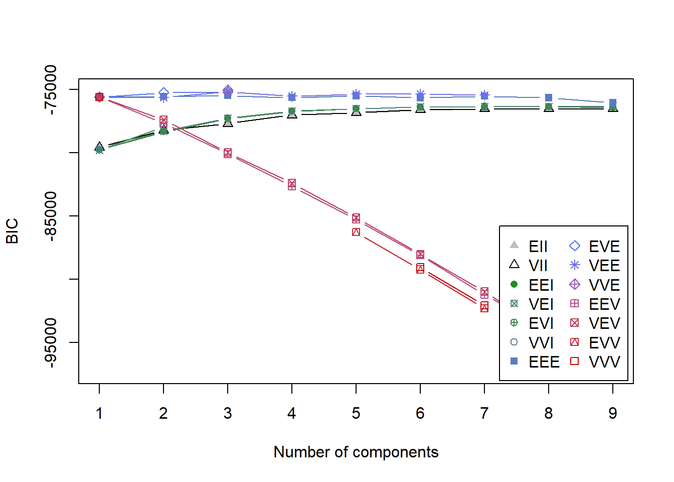
It’s not immediately clear which model is the best since the y-axis is so large and many of the models score close together. summary(BIC) shows the top three models based on BIC.
summary(BIC)## Best BIC values:
## VVE,3 VEE,3 EVE,3
## BIC -75042.7 -75165.1484 -75179.165
## BIC diff 0.0 -122.4442 -136.461The highest BIC comes from VVE, 3. This says there are 3 clusters with variable volume, variable shape, equal orientation, and ellipsodial distribution (see Figure 2 from this paper for a visual). However, VEE, 3 is not far behind and actually may be a more theoretically useful model since it constrains the shape of the distribution to be equal. For this reason, we’ll go with VEE, 3.
mod1 <- Mclust(interests_clustering, modelNames = "VEE", G = 3, x = BIC)

summary(mod1)## ----------------------------------------------------
## Gaussian finite mixture model fitted by EM algorithm
## ----------------------------------------------------
##
## Mclust VEE (ellipsoidal, equal shape and orientation) model with 3
## components:
##
## log.likelihood n df BIC ICL
## -35455.83 874 628 -75165.15 -75216.14
##
## Clustering table:
## 1 2 3
## 137 527 210If we want to look at this model more closely, we save it as an object and inspect it with summary().
The output describes the geometric characteristics of the profiles and the number of cases classified into each of the three clusters.
BIC is one of the best fit indices, but it’s always recommended to look for more evidence that the solution we’ve chosen is the correct one. We can also compare values of the Integrated Completed Likelikood (ICL) criterion. See this paper for more details. ICL isn’t much different from BIC, except that it adds a penalty on solutions with greater entropy or classification uncertainty.
ICL <- mclustICL(interests_clustering)

plot(ICL)
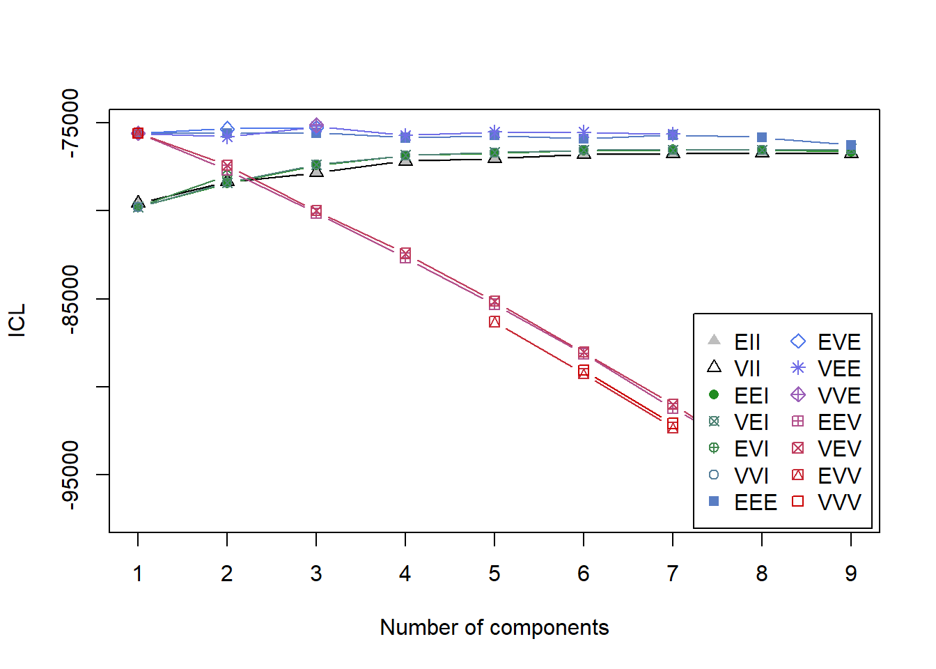
summary(ICL)## Best ICL values:
## VVE,3 VEE,3 EVE,3
## ICL -75134.69 -75216.13551 -75272.891
## ICL diff 0.00 -81.44795 -138.203We see similar results. ICL suggests that model VEE, 3 fits quite well. Finally, we’ll perform the Bootstrap Likelihood Ratio Test (BLRT) which compares model fit between k-1 and k cluster models. In other words, it looks to see if an increase in profiles increases fit. Based on simulations by Nylund, Asparouhov, and Muthén (2007) BIC and BLRT are the best indicators for how many profiles there are. This line of code will take a long time to run, so if you’re just following along I suggest skipping it unless you want to step out for a coffee break.
mclustBootstrapLRT(interests_clustering, modelName = "VEE")## -------------------------------------------------------------
## Bootstrap sequential LRT for the number of mixture components
## -------------------------------------------------------------
## Model = VEE
## Replications = 999
## LRTS bootstrap p-value
## 1 vs 2 197.0384 0.001
## 2 vs 3 684.8743 0.001
## 3 vs 4 -124.1935 1.000BLRT also suggests that a 3-profile solution is ideal.
Visualizing LPA
Now that we’re confident in our choice of a 3-profile solution, let’s plot the results. Specifically, we want to see how the profiles differ on the indicators, that is, the items that made up the profiles. If the solution is theoretically meaningful, we should see differences that make sense.
First, we’ll extract the means for each profile (remember, we chose these to be standardized). Then, we melt this into long form. Note that I’m trimming values exceeding +1 SD, otherwise we run into plotting issues.
library(reshape2) means <- data.frame(mod1$parameters$mean, stringsAsFactors = FALSE) %>% rownames_to_column() %>% rename(Interest = rowname) %>% melt(id.vars = "Interest", variable.name = "Profile", value.name = "Mean") %>% mutate(Mean = round(Mean, 2), Mean = ifelse(Mean > 1, 1, Mean))
Here’s the code for the plot. I’m reordering the indicators so that similar activities are close together.
means %>% ggplot(aes(Interest, Mean, group = Profile, color = Profile)) + geom_point(size = 2.25) + geom_line(size = 1.25) + scale_x_discrete(limits = c("Active sport", "Adrenaline sports", "Passive sport", "Countryside, outdoors", "Gardening", "Cars", "Art exhibitions", "Dancing", "Musical instruments", "Theatre", "Writing", "Reading", "Geography", "History", "Law", "Politics", "Psychology", "Religion", "Foreign languages", "Biology", "Chemistry", "Mathematics", "Medicine", "Physics", "Science and technology", "Internet", "PC", "Celebrities", "Economy Management", "Fun with friends", "Shopping", "Pets")) + labs(x = NULL, y = "Standardized mean interest") + theme_bw(base_size = 14) + theme(axis.text.x = element_text(angle = 45, hjust = 1), legend.position = "top")
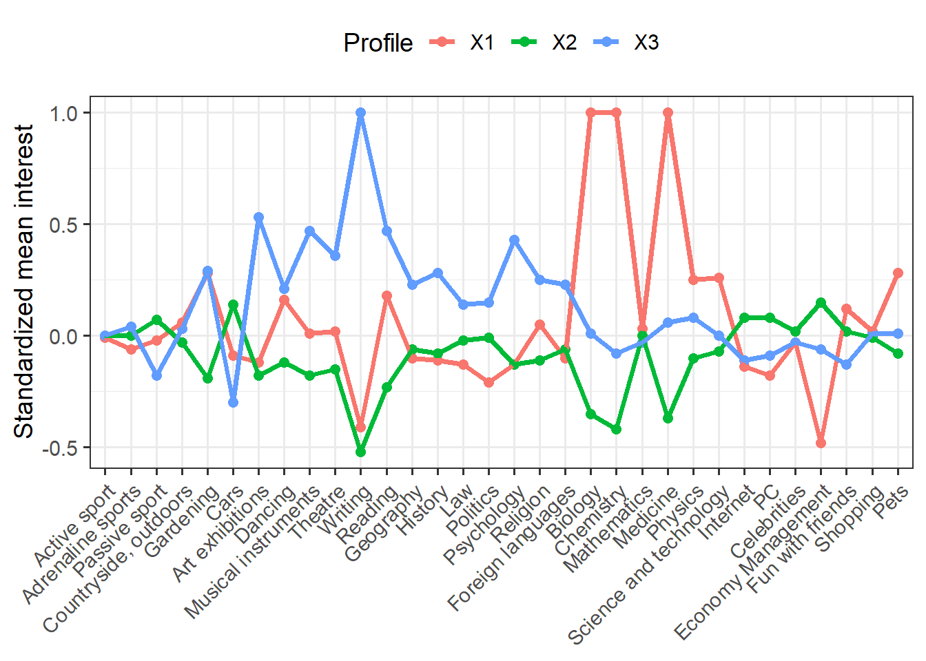
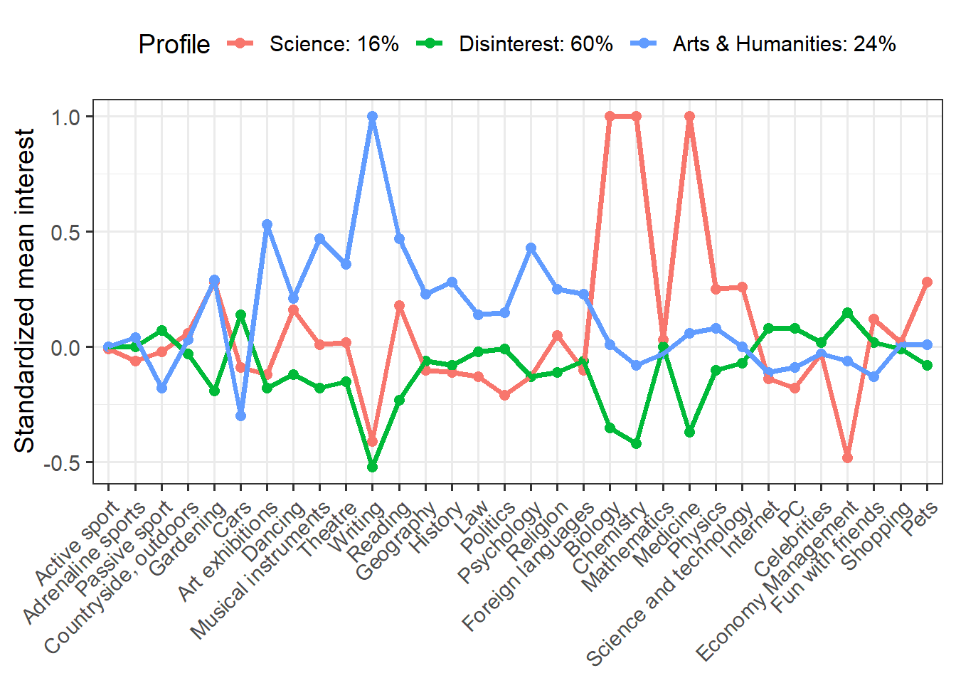
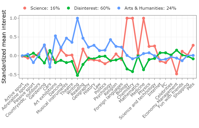
We have a lot of indicators (more than typical for LPA), but we see some interesting differences. Clearly the red group is interested in science and the blue group shows greater interest in arts and humanities. The green group seems disinterested in both science and art, but moderately interested in other things.
We can make this plot more informative by plugging in profile names and proportions. I’m also going to save this plot as an object so that we can do something really cool with it!
p <- means %>% mutate(Profile = recode(Profile, X1 = "Science: 16%", X2 = "Disinterest: 60%", X3 = "Arts & Humanities: 24%")) %>% ggplot(aes(Interest, Mean, group = Profile, color = Profile)) + geom_point(size = 2.25) + geom_line(size = 1.25) + scale_x_discrete(limits = c("Active sport", "Adrenaline sports", "Passive sport", "Countryside, outdoors", "Gardening", "Cars", "Art exhibitions", "Dancing", "Musical instruments", "Theatre", "Writing", "Reading", "Geography", "History", "Law", "Politics", "Psychology", "Religion", "Foreign languages", "Biology", "Chemistry", "Mathematics", "Medicine", "Physics", "Science and technology", "Internet", "PC", "Celebrities", "Economy Management", "Fun with friends", "Shopping", "Pets")) + labs(x = NULL, y = "Standardized mean interest") + theme_bw(base_size = 14) + theme(axis.text.x = element_text(angle = 45, hjust = 1), legend.position = "top") p

The something really cool that I want to do is make an interactive plot. Why would I want to do this? Well, one of the problems with the static plot is that with so many indicators it’s tough to read the values for each indicator. An interactive plot lets the reader narrow in on specific indicators or profiles of interest. We’ll use plotly to turn our static plot into an interactive one.
library(plotly) ggplotly(p, tooltip = c("Interest", "Mean")) %>% layout(legend = list(orientation = "h", y = 1.2))
There’s a quick example of LPA. Overall, I think LPA is great tool for Exploratory Analysis, although I question its reproducibility. What’s important is that the statistician considers both fit indices and theory when deciding on the number of profiles.
轉貼自: Will Hipson
若喜歡本文,請關注我們的臉書 Please Like our Facebook Page: Big Data In Finance

留下你的回應
以訪客張貼回應