
摘要: Be sure to choose a chart that works best for your data.
The type of chart to use when creating data visualizations depends on three factors: the underlying data, your audience, and how you’d like to present the data.
Picking the right chart type can be difficult as there are many ways to visualize data. This article features the different types of charts, their definitions, and when to use them. Each chart type is paired with a visualization and the sample data used for reference.
1. Comparison
Comparison charts are designed to show the hierarchy between categories, such as size and quantity of different items.
Horizontal bar
The horizontal bar chart is used to compare different items. For clarity, It should always start at 0 on the axis for the most accurate representation.
Ideally suited for
- comparing numerical data (e.g., survey responses, total sales per month, population by city).
- displaying the ranks of values in a sorted order.
For example, the following horizontal bar chart shows survey responses for the top 10 personal values around the world for a meaningful life in 2021.
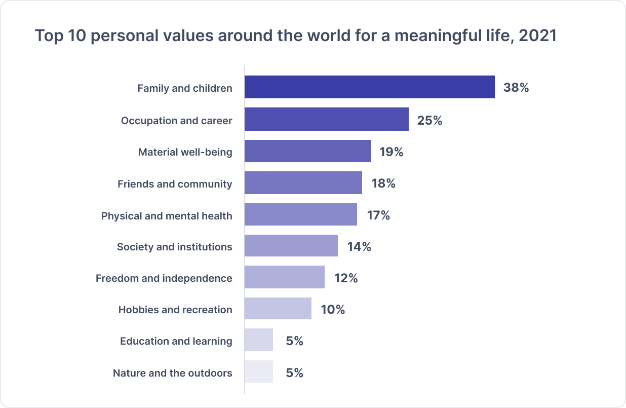
▲來源:Source: Pew Research Center, What Makes Life Meaningful? Views From 17 Advanced Economies, 2021
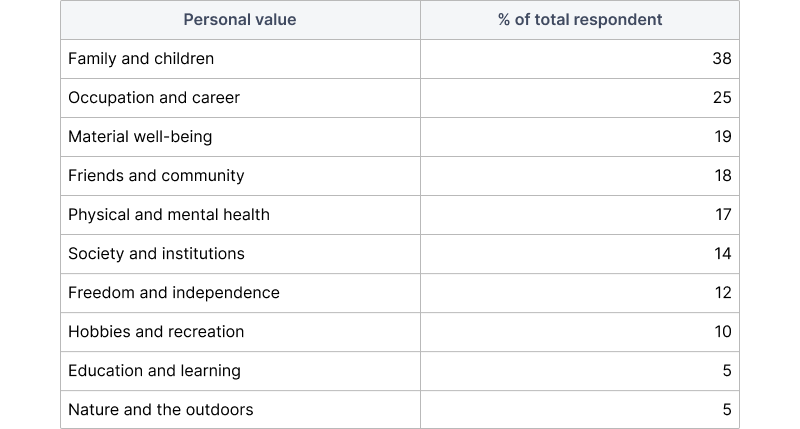
The chart input looks like this:
Grouped bar
The grouped bar charts are used to show two or more data series side-by-side and grouped together under categories, all on the same axis.
Ideally suited for
- showing how the second category variable changes within each level (e.g., income by gender within the education level).
- showing how the first category variable changes across levels (e.g., income by gender within all education levels).
For example, the following grouped bar chart shows the average U.S. income by level of education and gender in 2020.
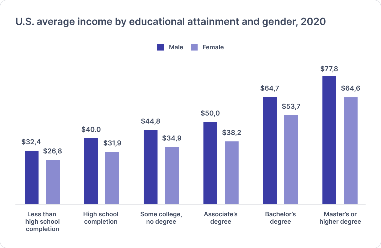
▲來源:Source: National Center for Educational Statistics, 2021
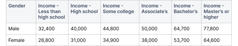
The chart input looks like this:
2. Composition
Composition charts are designed to show the breakdown of a single entity.
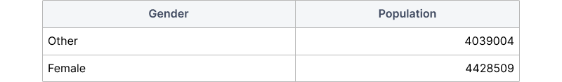
Donut
The donut chart is used to show part-to-whole data. It’s similar to a pie chart, though the middle has space to include more information about the data (e.g., total). To avoid confusion, it’s best to represent only a few values and always pair the values with clear labels.
Ideally suited for
- showing proportional parts within the whole (e.g., gender, device type, asset allocation).
- showing 2–5 values that add up to 100% as a standalone piece of information.
For example, the following donut chart shows the percentage of the female population in comparison to the total population of New York City in 2021.
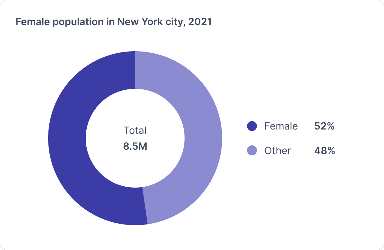
▲來源:Source: U.S. Cencus, QuickFacts New York city, New York
The chart input looks like this:
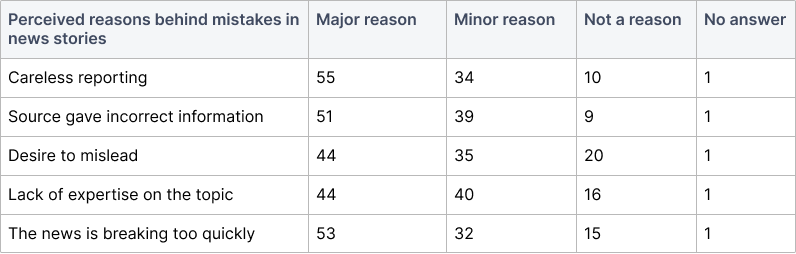
100% Stacked bar
The 100% stacked bar chart is used to show how a larger category is divided into smaller categories and what the relationship of each part has on the total amount. They can be hard to read if many segments within each bar have small values.
Ideally suited for
- representing survey responses with a Likert scale (e.g., agree, neutral, disagree).
- showing differences between quantities in each group.
For example, the following stacked bar chart shows the percentage breakdown of survey responses of U.S. adults regarding the perceived reason behind mistakes in news stories in 2020.
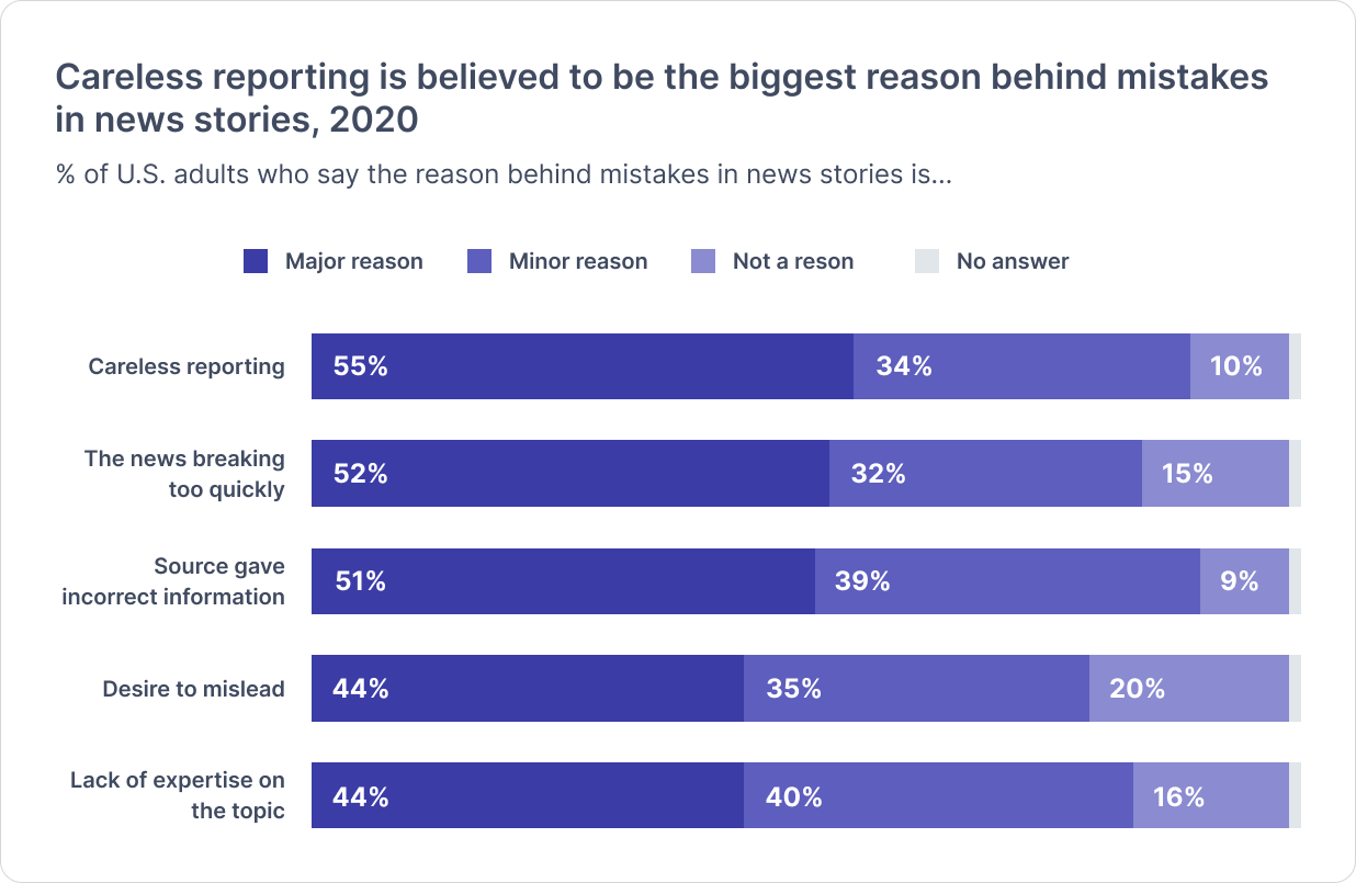
▲來源:Source: Pew Research Center, American Trends Panel Wave 62, 2020
The chart input looks like this:
3. Trend over time
Trend over time charts are designed to show changes over short and long periods of time.
Line chart
The line chart is used to show trends and change over time. Line graphs can also compare multiple trend lines but avoid using more than 3–4 lines per graph for easier reading.
Ideally suited for
- representing various trends over time (e.g., income, population, revenue).
- showing a continuous data set to analyze how it has changed over time.
For example, the following line chart shows the percentage of the uninsured New York state population between 2014 and 2020.
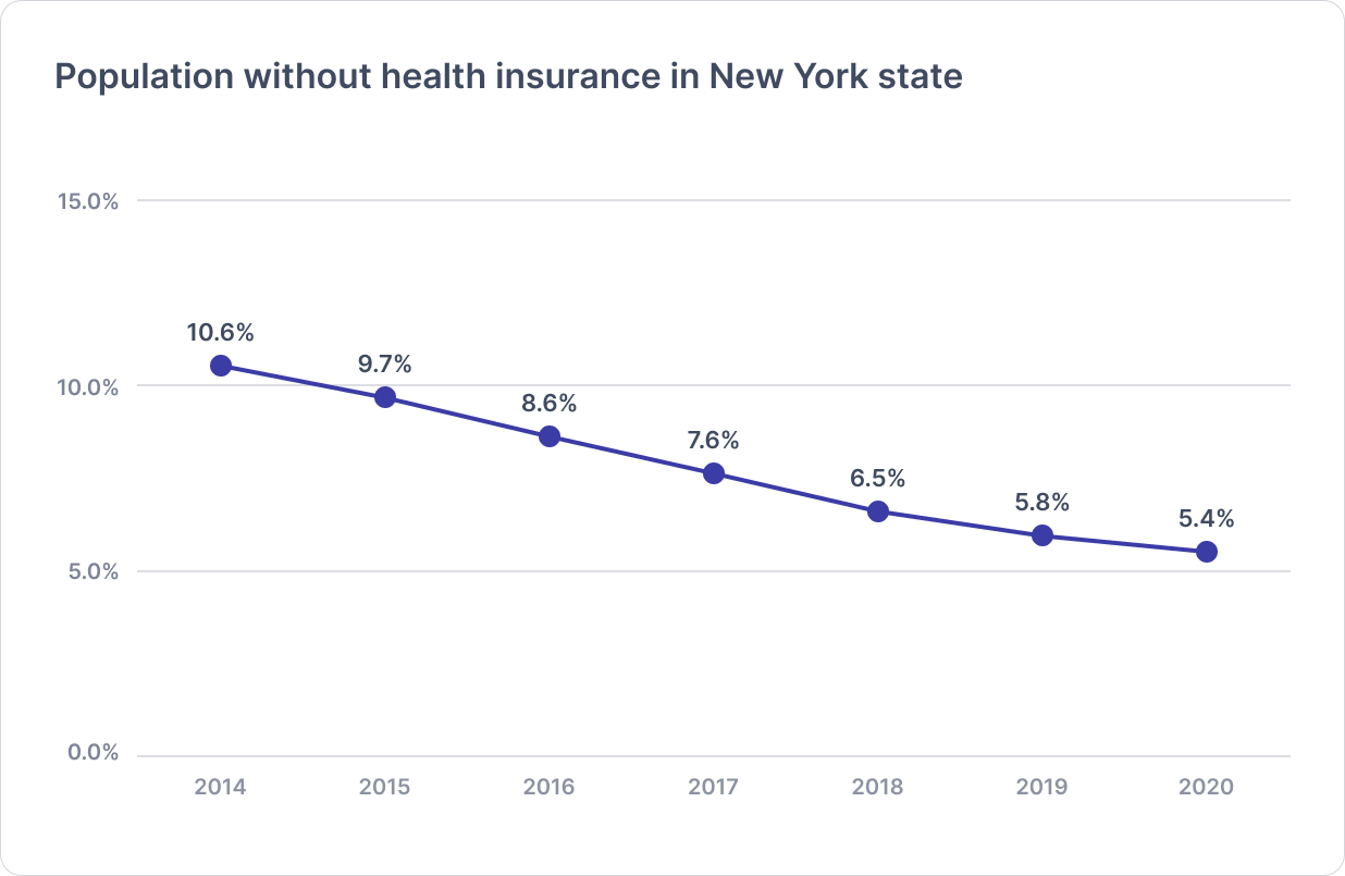
▲來源:Source: U.S. Census, American Community Survey
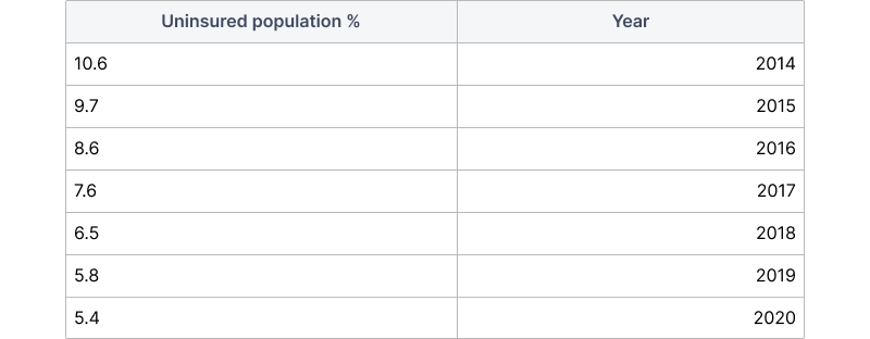
The chart input looks like this:
Stacked area chart
The stacked area chart is used to track a few variables with quantitative values over a time period. Consider ordering the largest groups at the bottom, with the most variable or smallest groups last and on top, so the changes are easy to see.
Ideally suited for
- showing multiple data series that start each point from the point left by the previous series (e.g., steady decline or growth).
- comparing multiple variables’ changes over time.
For example, the following stacked area chart shows a breakdown of energy sources that cause global greenhouse gas emissions since 2019.
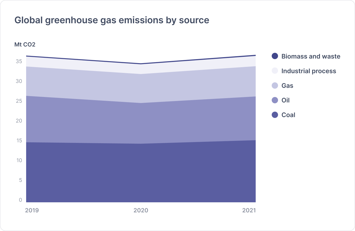
▲來源:Source: IEA, Global Energy Review: CO2 Emissions in 2021
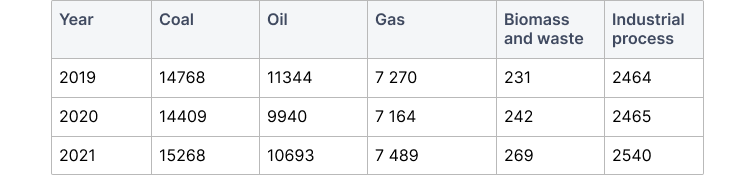
The chart input looks like this:
4.Correlation
Correlation charts are designed to show relationship between two or more variables.
Scatter plot
The scatter plot is used to show the distribution of data in relation to two variables, shown on the X and Y axis. The strength of the correlation can be determined by how closely packed the points are to each other on the graph. Points that end up far outside the general cluster of points are known as outliers.
Ideally suited for
- showing correlations or relationships between non-time variables (e.g., height, weight, income).
- displaying outliers or anomalies in your data set.
For example, the following scatter plot shows the height correlation of the top 200 NBA players with the highest PPG (points per game) between 1960 and 2020.
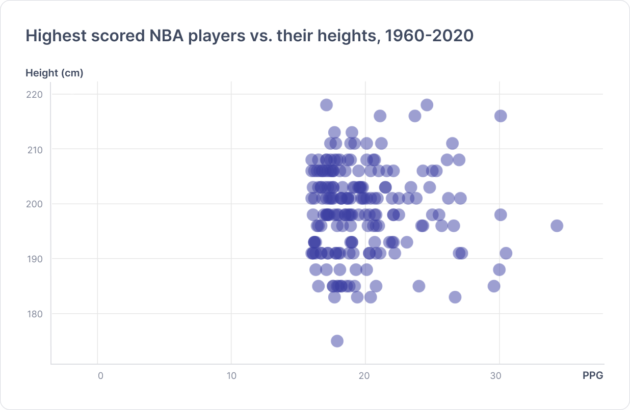
▲來源:Source: Rlist, Basketball players: NBA, 1960–2020
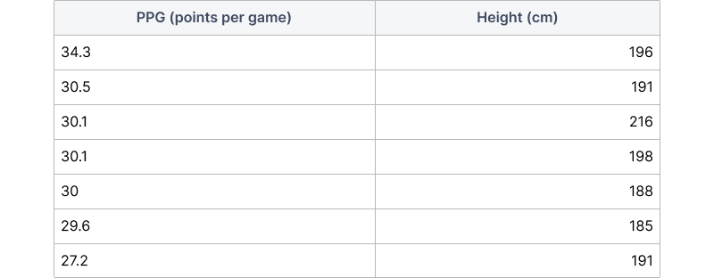
The chart input looks like this:
Heatmap
A heatmap chart is used to visualize data through variations in coloring. They are useful in summary format because it’s hard to see fine-grained differences between colors across large datasets.
Ideally suited for:
- showing variance across multiple variables, revealing any patterns (e.g., precipitation distribution, density over time).
- displaying whether any variables are similar to each other and for detecting if any correlations exist in-between them.
For example, the following heat map shows selected countries with the highest unemployment rates in 2021 and their past rates since 2018.
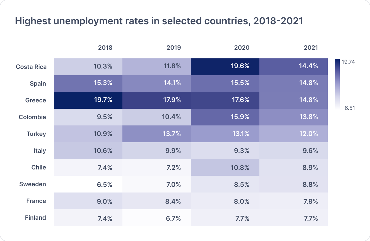
▲來源:Source: OECD, Unemployment rate
Resources
The below resources helped me to write this article. I hope you can use them to dig deeper into this topic.
Guidelines:
- The Data Visualization Catalogue — datavizcatalogue.com
- Journal: Getting Started with Data Viz —observablehq.com/@didoesdigital/links
- Chartio Data Tutorials — chartio.com/learn/charts/
Chart Choosers:
- FT Visual Vocabulary — ft.com/vocabulary
- Data Viz Project —datavizproject.com/
轉貼自Source: uxdesign.cc
若喜歡本文,請關注我們的臉書 Please Like our Facebook Page: Big Data In Finance

留下你的回應
以訪客張貼回應